

Overview
Shadcn/ui Figma Library is a design system I built to bring the logic of shadcn/ui, Tailwind CSS, and component-driven development into Figma. The goal was not only to rebuild the UI visually, but to help designers use the right tokens, spacing, states, and component structure so developer handoff becomes easier.
Why I Built It
Frontend workflows are shifting from closed component packages like MUI or Ant Design toward more flexible systems: token-driven, primitive-based, and component-owned.
Shift | What changed |
|---|---|
Styling | Tailwind CSS makes styling faster and keeps it closer to tokens. |
Primitive | Radix UI supports accessibility and interaction logic. |
Ownership | Teams want to own their components instead of depending on closed packages. |
Speed | MVPs, POCs, and dashboards need to be built quickly while staying maintainable. |
Handoff | Figma needs to sit closer to tokens, anatomy, and implementation logic. |
For small product teams, building a design system from scratch is a large investment. So I chose a more pragmatic direction: follow ecosystems that frontend communities already trust, such as Tailwind CSS, Radix UI, and shadcn/ui, then build a Figma layer that fits the design workflow.
Core Idea
This library is not only for dragging and dropping components in Figma.
It helps designers use the right tokens, spacing, states, and component anatomy, so developers can read the file more easily and handoff requires less explanation.
Design side | Code side | Library handling |
|---|---|---|
Component | shadcn/ui component | Organized close to the original API reference and component anatomy. |
Token | Tailwind class / CSS variable | Maps color, spacing, and radius through tokens. |
Variant | Component state | Clearly separates default, hover, focus, disabled, and error states. |
Slot | Slot composition | Uses nested instances and wrappers to simulate slot-based composition. |
Naming | Component anatomy | Keeps names such as |
Handoff | Implementation intent | Documents what should stay close to the source system and what can be customized. |
Approach
I did not build the system by manually drawing every component and token. With a system like shadcn/ui + Tailwind CSS, that approach would be too slow and too easy to get wrong.
I used an AI agent + Figma automation to handle repetitive work, while I focused on the system logic.
Step | What I did |
|---|---|
Define structure | 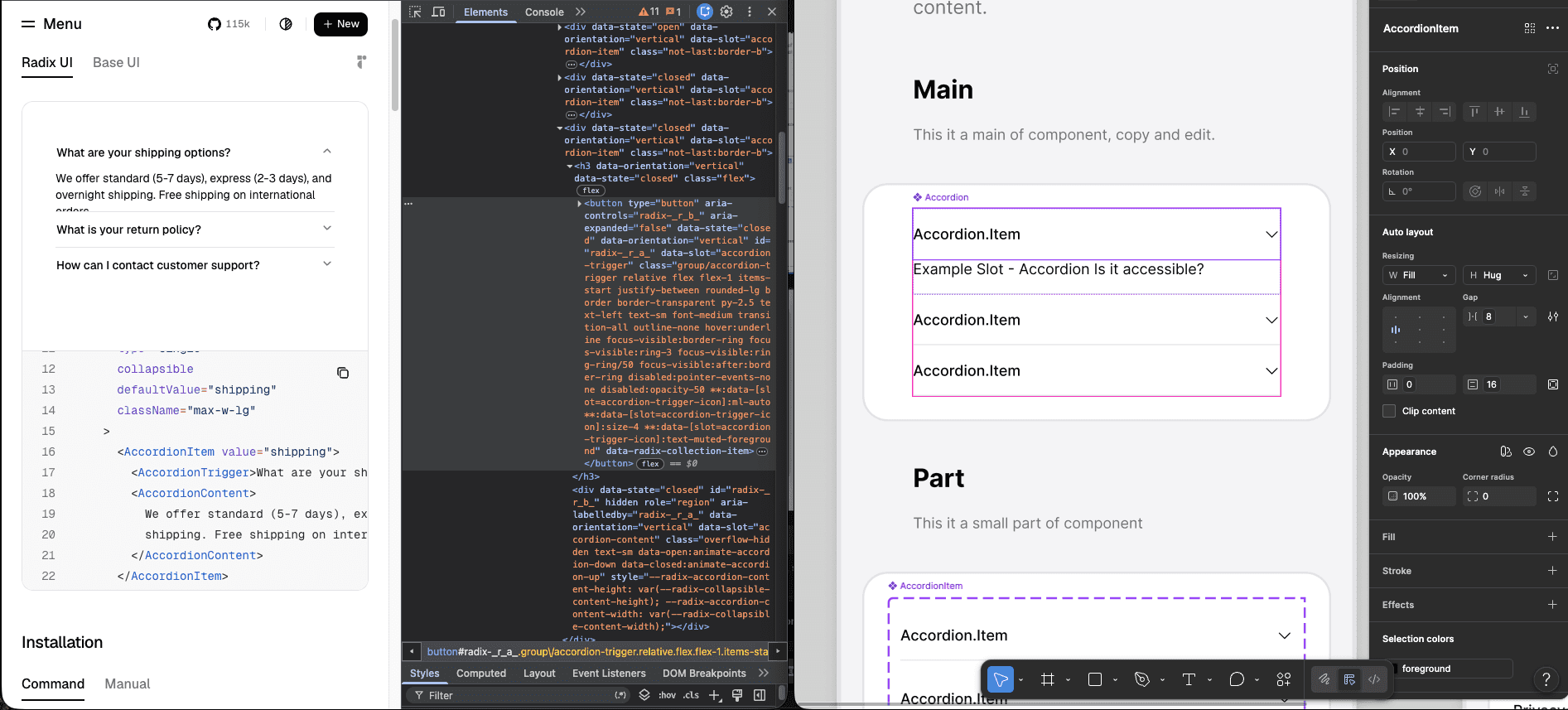 Defined Tailwind variables, semantic tokens, component anatomy, slots, states, and handoff guidelines. |
Generate tokens | 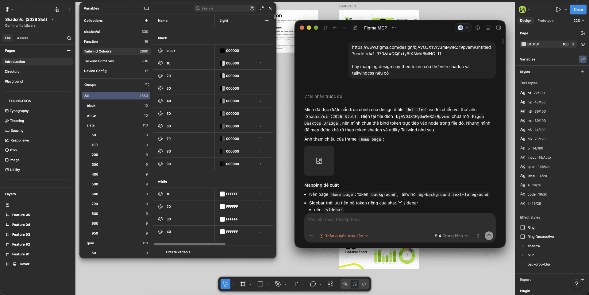 Used an AI agent through Figma MCP Console to generate more than 2,800 Tailwind variables faster. |
Clean naming | 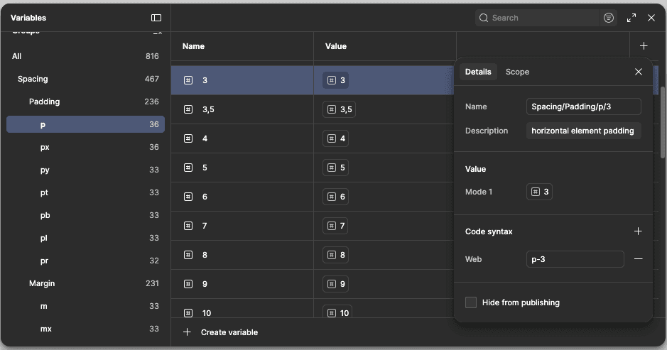 Reviewed naming, group trees, syntax, and spacing groups such as |
Build slots | 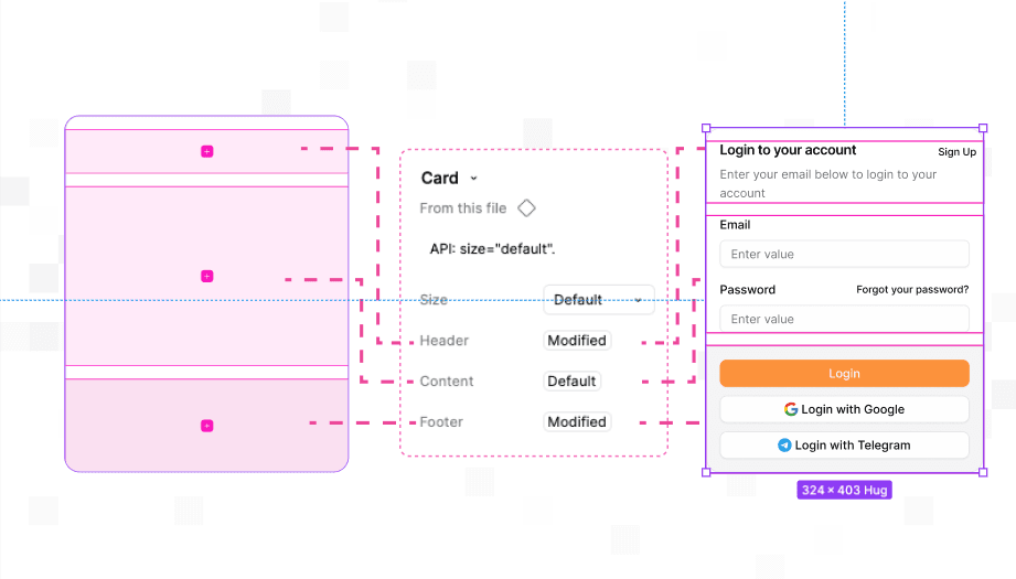 Used Instance Utils to simulate slot-like structure through wrappers and nested instances. |
Translate logic | 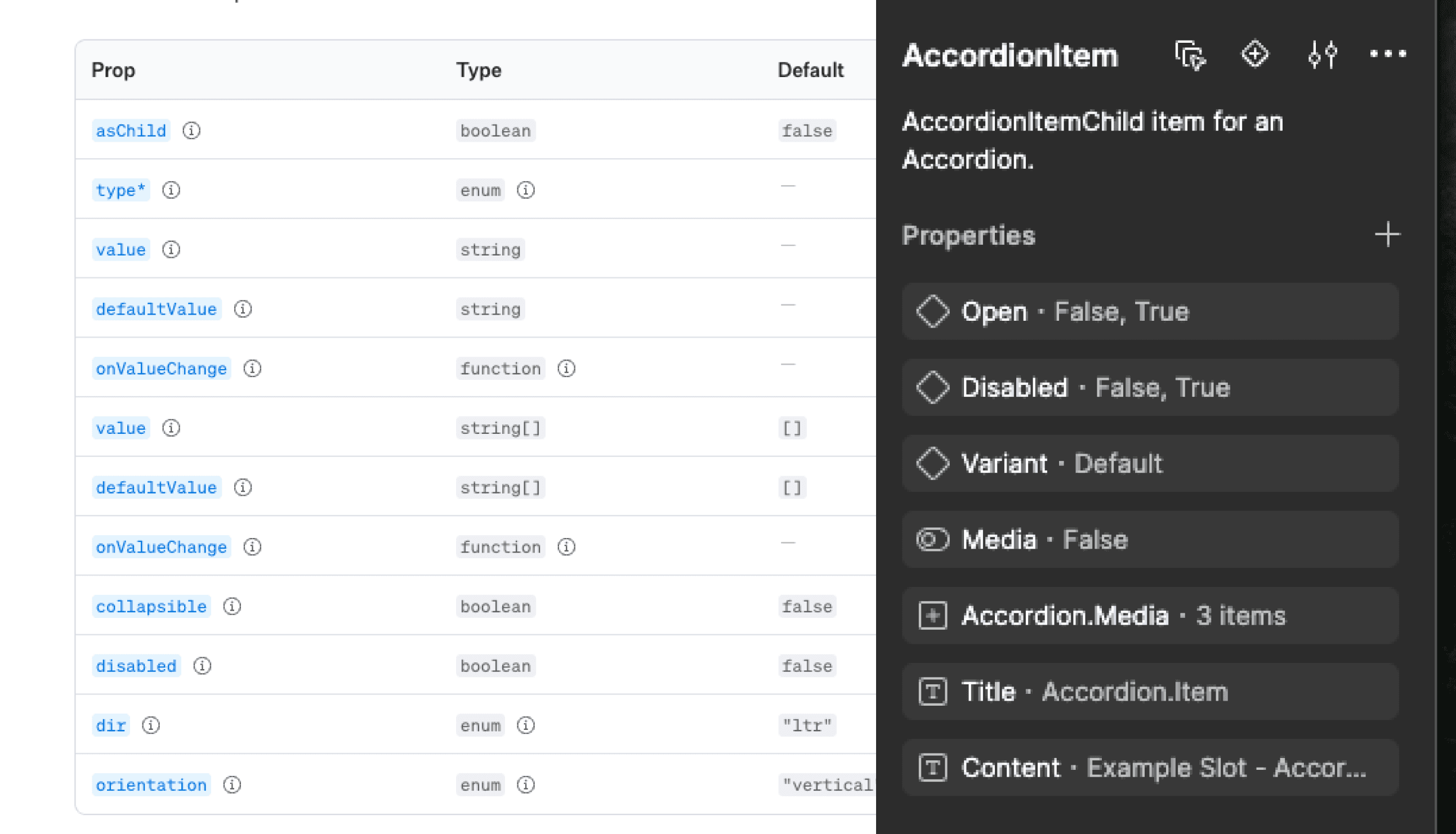 Kept only the logic designers need to move quickly and developers need to understand the file. |
Test & Outcome
I tested the real version across several finance & AI projects built with React.
Fewer Figma comments during handoff — clearer component structure, token usage, and state definitions reduced the need for PM/dev clarification.
Outcome: 10x faster build speed with only one designer.
Result | Impact |
|---|---|
Shipped in 2 weeks, ~3 months ahead of plan. |  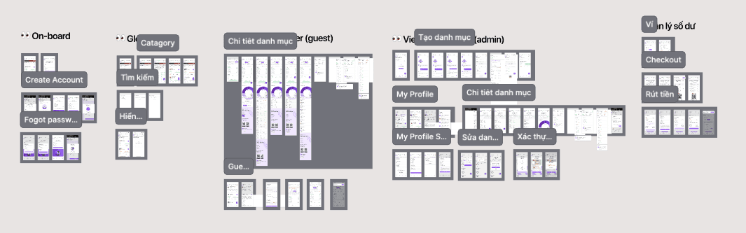 Shipped the first design version in 2 weeks and helped the project move ~3 months ahead of the initial timeline. |
Fewer Figma comments |  Less PM/dev clarification during handoff. |
Cleaner UI handoff |  Developers could inspect states, tokens, and component structure with less guesswork. |
Community Validation
The library was not just saved for inspiration — it was actually opened, used, and tested by the community.
Community traction validated the idea: designers needed a shadcn/ui Figma library that was easier to use, closer to Tailwind, and more practical for product UI work
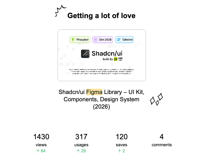
0 views
Likes


Comment