
Overview
A community-ready Figma UI kit inspired by shadcn/ui, built for designers who want to create fast, scalable, and developer-friendly interfaces.
This library is designed with a flexible component structure, TailwindCSS-based variables, editable slots, and reusable patterns to support modern web app design workflows.
What’s Inside
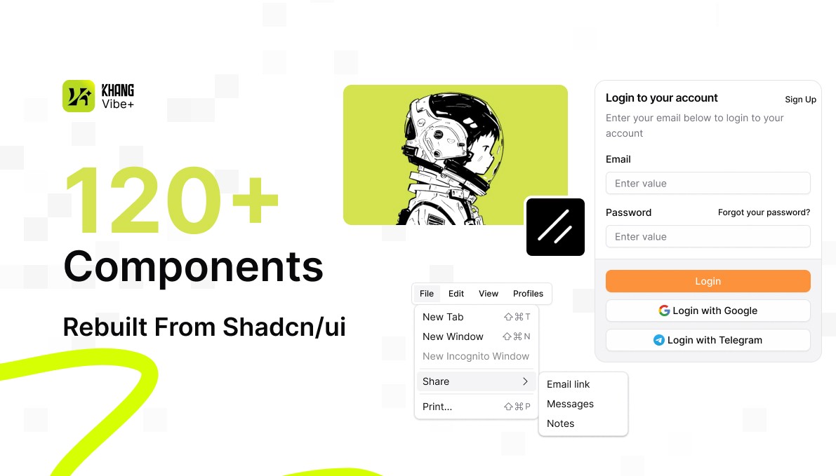
120+ shadcn/ui-inspired components
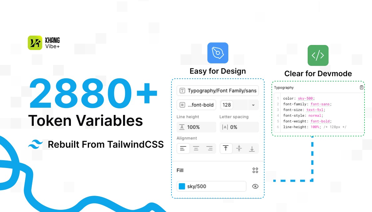
2880+ TailwindCSS design variables
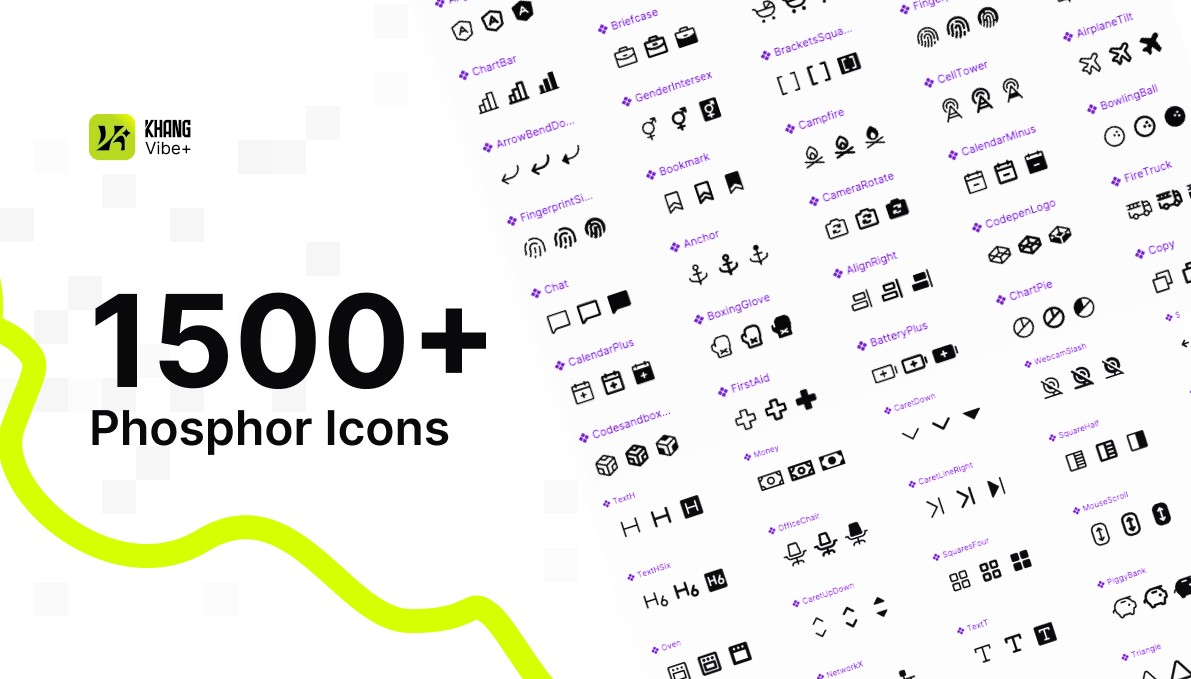
1500+ Phosphor icons
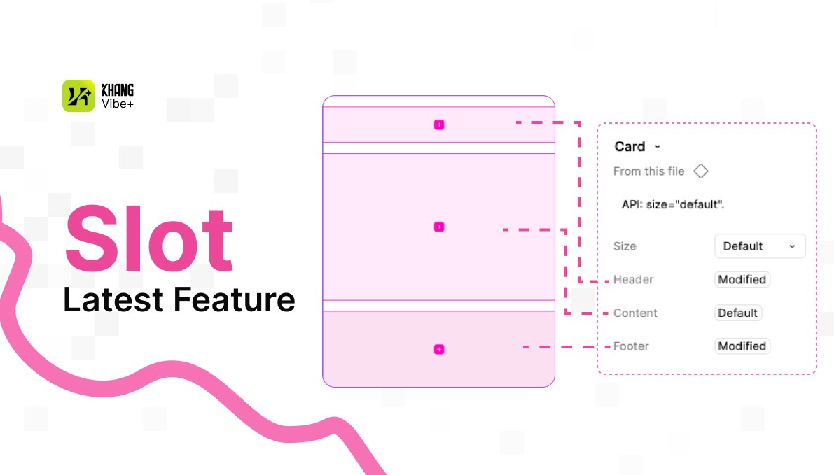
Latest Slot 2026 structure included
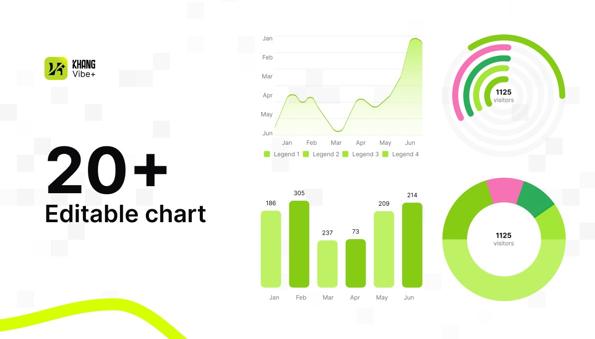
20+ editable chart components with slot-based customization
Flexible component variants for faster UI exploration
Clean naming system for smoother design-to-dev handoff
Built For
SaaS dashboards
Web apps
Admin panels
Internal tools
MVP products
Design systems
Developer handoff workflows
Why Use This Kit?
This UI kit helps designers build faster while staying close to modern frontend patterns. Instead of relying on rigid static components, the library uses a more flexible slot-based structure, making it easier to customize layouts, reuse patterns, and align designs with real implementation logic.
Perfect for solo designers, product teams, startups, and anyone working with shadcn/ui, TailwindCSS, or modern React-based product interfaces.
Tags: #Shadcn #shadcnui #Slot2026 #TailwindCSS #PhosphorIcons #DesignSystem #UIKit #FigmaLibrary #WebAppDesign
Tools used in this project
Shadcn/ui
Component library built on Radix UI and Tailwind CSS for fast, customizable, implementation-friendly interfaces.

Tailwindcss
Utility-first CSS framework for building responsive interfaces with consistent spacing, color, and layout rules.

Codex
AI coding agent used to inspect codebases, edit files, automate tasks, and ship product changes faster.

Figma
Collaborative design platform for interface design, prototypes, design systems, and developer handoff.
Comment